text from "the secret world of drawings"s to a picture we do not so e
"We can never accompany another person beyond where we have traveled ourselves. I am not saying the only a horse can judge a horse show, but it certainly helps to know something about horses before going about judging them.
Looking at a picture with no preconceived ideas may be difficult, yet we must try to take the picture at face value and see how it fits into its creator's life. When we come with this openness to a picture, we do not so easily project our own psychology onto others.
This projection is the greatest danger of all: that is, to come to a picture with preconceived ideas, to believe that another person's psychological is the same as our own.
An open mind is vital to the productive interpretation of drawing and helping a patient follow his own path, not the path that we think he should take.
There are three premises we must accept in order to understand language of drawings.
The first is that there is an unconscious, and that picture come from the same level as dreams."
As it says on the text, the "projection," is actually what I want to accomplish with my work. However, what is stated here is that the 'projection' is dangerous because the work was created during art therapy where everything is prioritised for the patient. In my case, the actual 'patient' is not the drawer or creator but the viewer, which means that I should not project my own thoughts by thinking/guessing how the viewer would think by looking at my work. I need to prioritise the viewer more in this project, and by that means, I shouldn't create too descriptive work that narrows down viewers perspectives, and give a space for the viewer to come in to the painting.
Gianfranco Baruchello
creating graph and figuration used with arrows and words in order to express what is in the artist mind is an interesting approach in painting.
Gianfranco Baruchello is a contemporary Italian artist known for his experimentation with a variety of media. Baruchello’s primary focus has led to a lifelong investigation of the human mind through drawings and paintings of symbols, systems, and words. “Every new work I make functions as a tool, a device to understand and test if my language is still working,” he has explained. Born in 1924 in Livorno, Italy, Baruchello studied law and later helped run his father’s business. A self-taught artist, his earliest works consisted of paintings based on the small details of his daily life. After moving to Paris in the early 1960s, he had a fateful meeting with Marcel Duchamp, who would become a lifelong friend. Baruchello later traveled to New York, where he met John Cage, and took part in the group exhibition “New Realists” at the Sidney Janis Gallery. After inheriting an abandoned villa outside of Rome in the early 1970s, the artist established a farm where he grows crops and raises cattle and sheep. The 94 year old currently divides his time between Rome, Italy and Paris, France. Today, Baruchello’s works are held in the collections of The Museum of Modern Art in New York, the Museum of Contemporary Art in Chicago, and the Centre Georges Pompidou in Paris, among others.
NEO RAUCH
Neo Rauch's (b. 1960) paintings are characterized by their distinctive combination of figurative imagery and surrealist abstraction. His enigmatic compositions employ an eccentric iconography of human characters, animals, and hybrid forms within familiar-looking but imaginary settings. While Rauch begins each work without a preconceived idea of the finished result, there is a uniquely recognizable, visual coherence to his oeuvre. Paintings often display palettes of strong, complementary colors, and recurrent subjects include the seamless integration of organic and non-organic elements as well as references to the creative process, music, and manual labor. The artist's treatment of scale is deliberately arbitrary and non-perspectival, and often seems to allude to different time zones or planes of existence.
Rauch was born in 1960 in Leipzig, where he continues to live and work, and studied at the Hochschule für Grafik und Buchkunst. Since 2000, Rauch's work has been represented by David Zwirner. His 2019 solo exhibition Propaganda, on view at the gallery’s Hong Kong location, marks the artist’s eighth gallery presentation and his first solo presentation in China. Previous solo exhibitions at the gallery in New York include At the Well (2014), Heilstätten (2011), Neo Rauch (2008), Renegaten (2005), Neo Rauch (2002), and Neo Rauch (2000), which marked his United States debut.
https://www.davidzwirner.com/artists/neo-rauch/biography
ROSE WYLIE
Really like how the actual painted elements are simple, yet powerful and I found some similarities in art therapy drawings and her work.
She's also using her materials and the base of the painting very well in order to create the 'depth' in her painting which I also want to take in. Her base looks like something she found, not something she created which also actually gives impression with the viewer to focus more on the element of the drawing, as well as the base/background not distracting too much.
She keeps the elements in her painting very close to the viewer of finding out the meaning, but still cannot understand what is actually going on. I like that relationship with the artist and the viewer, because it makes the viewers look into themselves rather than getting meaning from the painting.
Rose Wylie finds inspiration for her visually compelling paintings through her daily encounters and a variety of sources, from art history, cinema, comic books and the natural world to news, verbal anecdotes, celebrity stories and sport. These might include a scene from Quentin Tarantino’s iconic Kill Bill films, a self-portrait of Wylie eating a chocolate biscuit, or a football match. Her vibrant, large-scale canvases filled the walls of the Serpentine Sackler Gallery.
Quack Quack included paintings dating from the late 1990s to the present day – some never previously exhibited, including a new group of works inspired by Hyde Park and Kensington Gardens. One, based on Wylie’s childhood memories of living in Bayswater during the Blitz, maps the park’s landscape – dogs, ducks, the Serpentine lake, and both the historic building and Zaha Hadid’s present day extension of the Gallery – with memories of Spitfires and Messerschmitt planes fighting overhead. The exhibition title connected similarly to place as well as to ‘ack-ack’, a term used to describe Second World War anti-aircraft artillery.
Wylie often paints through the filter of memory and impression, using text to enhance facts and recollections and editing images by overlaying new pieces of canvas over images, like a collage. At times, the compositions of her paintings are informed by cinematic techniques, whether the multiple headshots of Sitting on a Bench with Border (Film Notes) 2008, based on Pedro Almodóvar’s 2006 film Volver, or Wylie’s two paintings from the 2005 film Syriana, which take in a panoramic and close-up shot of the same scene.
Instilled with wit, Wylie’s paintings are confident, animated and energetic, proposing new perspectives on the world and the plethora of images that make up our collective cultural memory.
https://www.serpentinegalleries.org/exhibitions-events/rose-wylie-quack-quack
ATLAS OF FACIAL EXPRESSION
looking at face expression, thinking what elements create the viewer to sense an emotion.
http://blood-pressure.imedpub.com/assessing-self-using-art-therapy-a-case-analysis.php?aid=7654
This website explains the detailed feature of art therapy drawing, and so very helpful in order to examine the drawings I've done.
FACIAL EXPRESSIONS
"Guillaume Benjamin Amand Duchenne de Boulogne"
using actual human picture, looking at expressions and the use of the facial features in emotions.
IMAGES OF ART THERAPY
I personally find these drawing made during art therapy really interesting to look at as these are drawings drawn without thinking about the viewer and audience presence which is something I find it hard to do recently.
It is also interesting to look at how theses were made without the artist having a theme or anything in their mind. They just drew this from their natural expressions. Which means these drawings are so raw and true to the feelings, and I find that approach in art creation is really important when working with the 'transportation of emotion' project.
PRINZHORN
"Search for Meaning and Crisis" features works by Sonja Gerstner and Marcia Blaessle, who painted their dreams and nightmares until they took their own lives. From December 17 until April 10, Dubuffet’s List will depict Dubuffet’s view on the Collection, based on his visit in September 1950.
aperfectcommotion: Emma Hauck, letter written to her husband while she was in a psychiatric hospitalfrom the Prinzhorn Collection (arsvitaest)
'Around 1910, James Edward Deeds, a patient in a mental asylum in Nevada, Missouri (State Lunatic Asylum No. 3) created 283 drawings on the letterhead of the institution. He calls himself the "electric pencil"
I really have interest in this drawing, not knowing exactly why but it still catches my eye which can be caused by the power of that rawness and stillness. Everything in this drawing looks so still, but there is something beyond that makes me feel like there is more to it. I also like the selection of what is drawn. Tiger, person and the frame. Everything looks very symbolic and each elements are strong.
Marlene Dumas
Her paintings expresses raw and strong emotions. She does that by using the elements of oil paint effectively. She leaves out some blank space for the viewers emotion to go within, and think about the inner self. Although she works by using photographs, the person painted looks like they live within the painting and looks very much alive. That 'aliveness' and 'rawness' can be used to transport emotions.
Cy Twombly's work
One thing I like about Cy Twombly's work is the speediness. By looking at his work, I can sense the presence of the artist, which ables for the viewers to sense the emotions and the actual body motion but in unconscious level.
The lines look very alive and strong, it seems like there was no barrier between the artist and the work, which also ables for the viewer to have no barriers between his work.
I think the strangeness of his work is how the work looks and exists like its 'ours' not only for artists.
Helena's Dream, 2008 Oil on canvas 51 2/5 × 43 3/10 in 130.5 × 110 cm
THE SECRET WORLD OF DRAWINGS
This drawing itself really attracts me. I like how the sheep shape is drawn with blue and the other elements is drawn by bright colours. The drawing looks very iconic and it sticks in my head for quite a long time. The drawing itself is really simple, but it still gives me emotions of somehow powerfulness and aggression which I found it interesting.
PRINZHORN
Before his committal at the age of twenty-four Horacek was a gardener. Diagnosed as schizophrenic, he refused all communication. Sometimes he responded to a question but never “to the point”, turning his head away. From 1979 drawing became his only means of communication. His oval faces are divided horizontally and transversely. Each box seems to function as an autonomous cell that appears to have its own life, a drawing in itself, but also as a part of a whole.
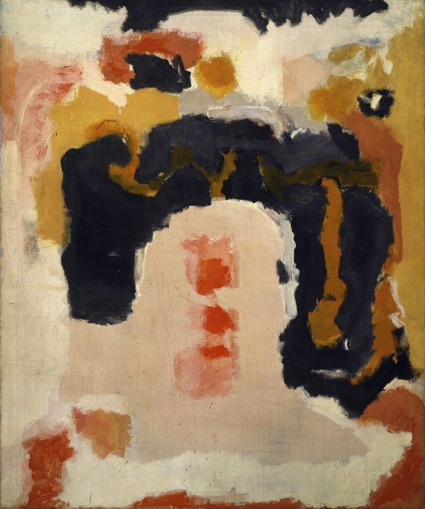
Mark Rothko
From the book
The Artist's Reality ; Philosophies of Art
"Art is not only a form of action, it is a form of social action. For art is a type of communication, and when it enters the environment it produces its effects just as any other form of action does."
yayoi kusama
https://hirshhorn.si.edu/kusama/yayoi-kusama/#eternal-soul
MY HEART'S ABODE, 2016
Acrylic on canvas
194 x 194 x 7 cm
My Eternal Soul
Begun in 2009, My Eternal Soul currently comprises over five hundred works. Kusama has said that through this series, she hopes to trace the “beauty of colors and space in the silence of death’s footsteps and the ‘nothingness’ it promises.” Within these paintings, which embody both the radiance of life and the sublimity of death, motifs from Kusama’s earliest works are often echoed, giving evidence to the singular vision that has driven her over the course of her long career. The effects of color vibration and exuberant patterning, for instance, are reminiscent of Kusama’s works on paper from the 1950s and 1960s. And, like her Infinity Mirror Rooms, which are simultaneously enclosed and expansive, colors and patterns pulsate within the bordered spaces of these canvases. The pattern of peering eyes is consistent with her tendency toward obsessive, endlesslly proliferating images, and the voyeuristic pattern transforms flat color fields into shadowy depths. Other biomorphic forms, some resembling microorganisms, populate Kusama’s strange landscapes, and titles such as Aggregation of Spiritssuggest that these paintings may be surrogates for human souls.
Infinity Nets Yellow, 1960
Oil paint on canvas
240 x 294.6 cm
Infinity Nets
Kusama created her Infinity Net paintings during her first years in New York, a time when she faced tremendous financial and emotional hardship. The repetitious motion of inscribing tiny arcs on a solid black background served as a meditation through which she made works “without composition—without beginning, end, or center.” Though stemming from a very personal experience, Kusama’s “interminable nets,” later called Infinity Nets, were remarkably prescient to the formal questions of art in the 1960s. Embodying the painterly qualities and the emphasis on process that are characteristic of Abstract Expressionism, these works also echo the restraint and monochromatic palettes of Minimalism.
I really like the strong expression her painting has. It feels like the expression comes straight to the audience, which is also my intention of my project.
When I always check her video of painting, I came to realise how all the elements are actually drawn one by one from herself.
The canvas are very big comparing to what she is drawing one by one, and i think that making the viewer feel the action of her drawing is also important in order to create catharsis.
Madness and art in the Prinzhorn collection. 2001. The Lancet, 358(9296), pp. 1913.
ABOUT SRCIBBLES
CY TWOMBLY
ABOUT WORDS
CY TWOMBLY
Thinking about using words as a powerful element in painting, I tried to search hint on what kind of word I should add and the intention behind it.
ABOUT TITLE
CY TWOMBLY
Rothko
https://www.artsy.net/article/artsy-editorial-mark-rothko-artist
Follow your childlike instincts
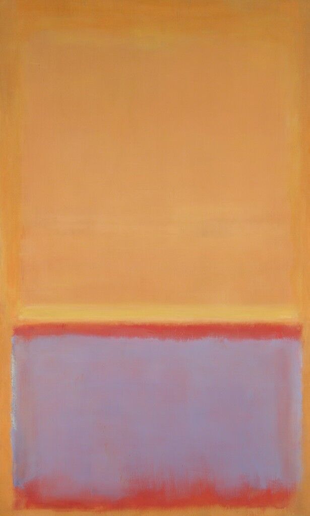
Express the inexpressible
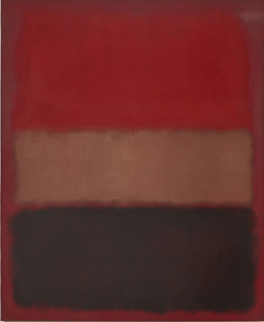
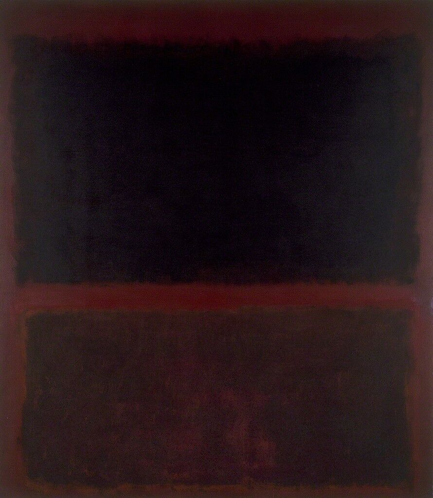
Eliminate barriers between audience and canvas
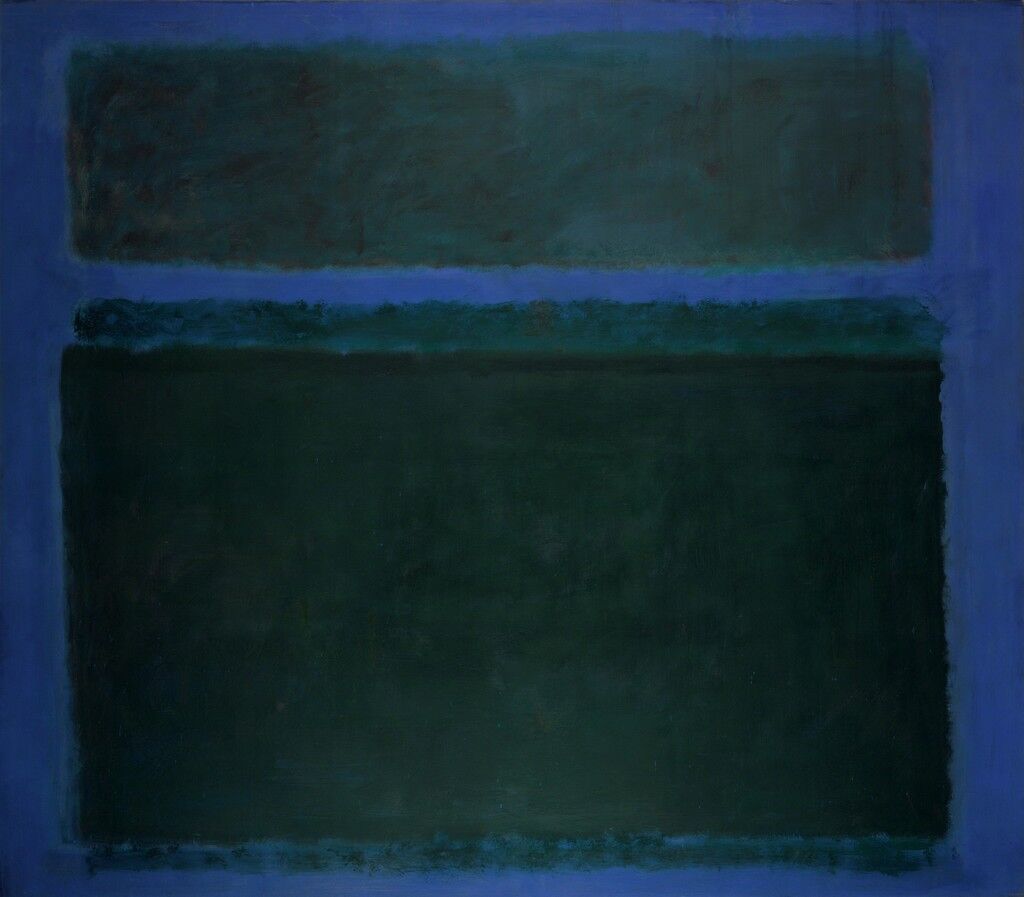
Remove ego from your art
e thickness
https://galerie-karsten-greve.com/en/exhibition/Cy-Twombly/Paper-October-12-2013-February-8-2014/en
I really like how the paint is placed thick but on the canvas/painting it does not look heavy and stays to create the role of what it wants to express.
I like how there is a line between the scribbles and also drawing as a painting. I want to create this space of audience thinking in my work as well.
Might use big wood to paint on, I like the boldness of this painting.
haruna kawai
I personally like her use of shapes, colours and the structure in her painting.
She uses the shapes effectively in creating the atmosphere and the point where those shapes meet each other is strong and sharp which I want to also use for my paintings to create some sort of tense atmosphere and sharpness.
Mark Rothko
From
The Rothko Book
"Rothko told Seitz that he wanted 'our response in terms of human need. Does the painting satisfy some human need?' In his view, the emotional element with which he felt he had imbued his work appealed to the imagination of the general observer more than formal analysis."
about colour composition;
"I'm interested only in expressing basic human emotions, tragedy, ecstasy, doom."
presentation
"His belief was that the positioning of his works, rather than a text, could aid viewers in their response. He added that this initial powerful impact may well give the key to the observer of the ideal relation ship between himself and the rest of the pictures.
abstract
"he stated that he thought of hid pictured as dreamers while the shapes in the pictures are performers and organisms with coalition and a passion for self assertion."
Mark Rothko’s paintings and Cy Twombly’s paintings, I’ve come to realise that the reason why these two painters works are successful in terms of creating therapeutic change is because what they actually create are not forms of the viewers emotional state/unconsciousness, but projections of our inner selves.